
Spotify has updated its desktop experience with a complete revamp that redesigns Your Library and Now Playing interfaces, plus cleans up the GUI for a fresh and funky new look.
The company says the change was made to align the desktop experience with its mobile app, and it’s quite evident here. At first glance, it appears the main page remains unchanged, albeit cleaner looking and streamlined, but there’s a little more to it than meets the eye. You can now explore, browse and reorganise Spotify libraries as if you would on mobile.
For starters, the left-hand side of the app window once featured an anchored list that ran from top to bottom in text as; Home, Search, Your Library, Create Playlist, Liked Songs, Your Episodes, and finally, a list of custom playlists. It was a messy distraction, and I often found myself searching endlessly in the left window pane for a specific album or playlist before ultimately giving up and searching for a specific song, thereafter allowing it to run a follow-up recommended playlist based on my search. Phew.
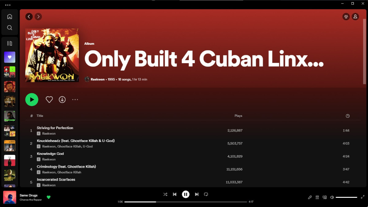
This has all changed now. The left window features a cleaned-up interface with ‘Home, Search, and Your Library’ icons, and recently played artist and album cover icons below, allowing for a quick and easy listening experience. I like that. Furthermore, clicking on the library icon expands this playlist for extra details and a named list. Furthermore, clicking the now-visible arrow icon in the tray allows for an even more detailed view of your library, with options to search, customise, filter and sort a carefully curated list.
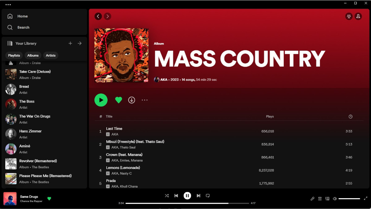
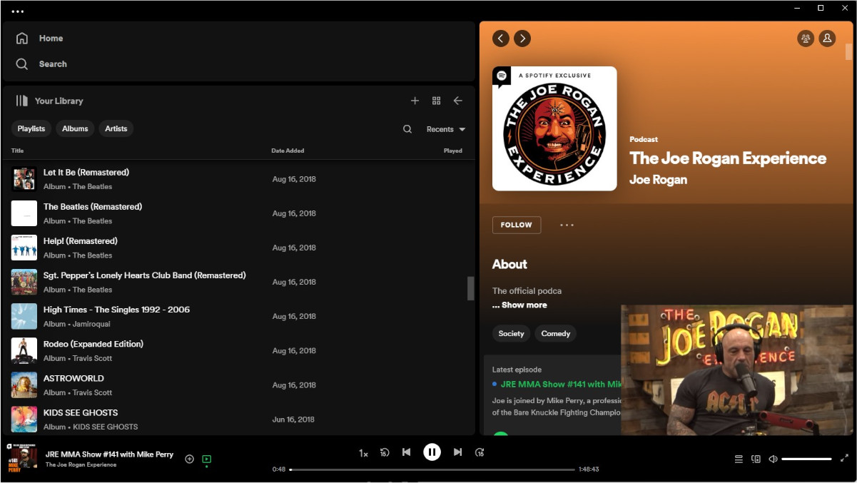
Meanwhile, if you have sights on the right side of the screen, you will find a Now Playing view which shows the current playing song or podcast, alongside additional information, and details such as tour dates, merch, transcripts, or episode descriptions for podcasts.
If you feel something’s missing here, you’re right, but it’s not completely gone. The friends activity interface that used to be there is now hidden behind an icon on the top right, next to your own profile icon. Neat.
Spotify also included a handful of useful tips to get you started with the redesigned interface; they are as follows:
- Go compact: By default, you’ll see an expanded view of Your Library. But if you only want to see your playlist icons, you can simply click the “Your Library” button in the top right hand corner to collapse the library.
- Search & filter Your Library: Previously, the only way to find playlists was through the search bar—and you had to wade through not only your own content, but results from the entire Spotify catalog. Now, when it’s expanded, our new Library design allows you to toggle through your dedicated music, podcast, and audiobook feeds and search Your Library exclusively.
- Customise: We want this experience to fit the way you listen, which is why Your Library and Now Playing can both be resized to take up more or less of the screen.
- Pin, drag & drop: You can move and pin the playlists in the Library, as well as drop songs into the editable listed playlists.
The new Your Library and Now Playing view should be available for perusal. Hope this bit of information helps.