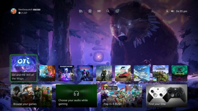
Microsoft has released a new Xbox dashboard to alpha testers aimed at balancing the experience, accessibility, function, and needs of the community.
Starting this week, users in the Alpha or Alpha Skip-Ahead rings can preview the updated dashboard that is said to have evolved based on player feedback. Xbox gamers seeking wholesale changes may however be disappointed; the update is mainly aimed at ease of use and general accessibility, meaning no major feature implementations or deep settings alterations.
“We designed hundreds of options, then refined with prototypes and finally user-tested in our Research labs until we found one we hope you’ll love,” said Ivy Krislov, senior product manager lead.
To be specific, this update brings a new top menu with five icons from left to right, the game library, Xbox store, Game Pass, Search, and Settings, offering quick access to frequently-used features. The front row game/app icons are smaller and have been pushed down screen, leaving an unobstructed view over any dynamic background images – something that apparently insider testers have recommended. The tile (icon) corners also seem to be more rounded, which is nice if you ask me.
Xbox’s new UI in a nutshell:
- Provides easy navigation to your library, the Microsoft Store, Xbox Game Pass, search, and settings at the very top of your Home by introducing a new quick access menu.
- Simplifies the layout and makes more space for you to see your background by reducing the size of some of the tiles and moving them to the bottom of the screen.
- Adds a responsive game art feature to update the default background and show off the beautiful art associated with each title when you hover over the tiles.
Xbox teams have also updated the ‘My games & apps’ menu letting users know if there is any noteworthy information, such as updates or wish-listed game sales. As long as these notifications don’t include any useless alerts or ads, they are welcome, as I personally missed some nice sales simply because I don’t check the store/wishlist each time I turn on my console.
Something that many would like is a user-customisable first row leaving the choice of which app to permanently pin there instead of a revolving list based on the latest launched app. There’s still plenty of time for further evolution, as Microsoft’s proposed design could well change before a wider release.
While visual improvements are always welcome, I also hope the Xbox team will continue to iron out any remaining kinks to usability. Controller disconnections continue to be a source of frustration, as is gameplay recording that requires OneDrive to be accessed from PC, oftentimes with video and audio desync issues. There’s always room for improvement on the software front.

