

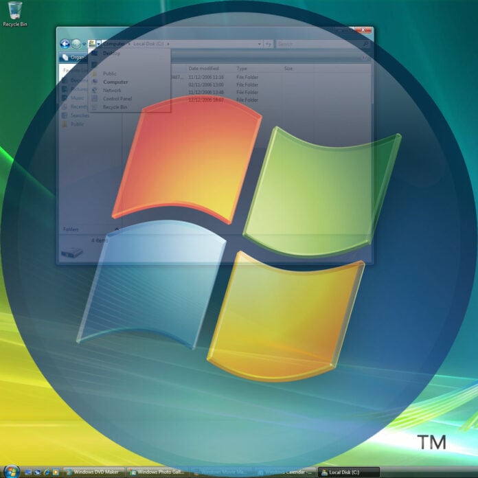
There’s a common saying that “less is more” and, while there are certainly times when it has its place, I generally take issue with it. Give me the complex 12-minute Iron Maiden epic over the three-minute simple indie song. Bring me that detailed fantasy art poster rather than a framed Rothko print. And yes, Microsoft, give me an ostentatious, fancy-looking transparent user interface, rather than a boring flat one.
Give me a 12-minute Iron Maiden epic over a three-minute pop song.
Microsoft recently unveiled its “new” Xbox logo (or XBOX logo, as it’s apparently called now), which is actually exactly the same as the last one in terms of its core design. Asha Sharma’s team has basically just replaced the flat monochrome colour scheme with a dynamic glowing green instead.

I much prefer it. Flat graphic design has been a thing for a few years now, and I’ve never liked it – I’m sure I can’t be the only one who’s very glad to see it’s now retreating.
I’d like Microsoft to now make another step, and it’s likely to be contentious – bring back Aero. First introduced with the much-maligned Windows Vista, Aero (short for Aero Glass) made various UI elements in Windows transparent, so you could see a translucent image of the window behind the one in which you were working in areas such as the title bar. I loved it.
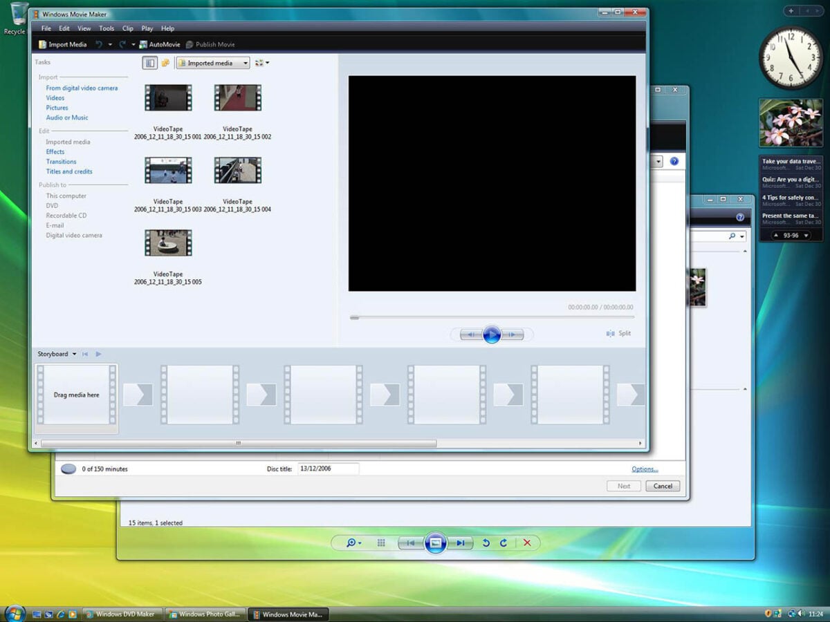
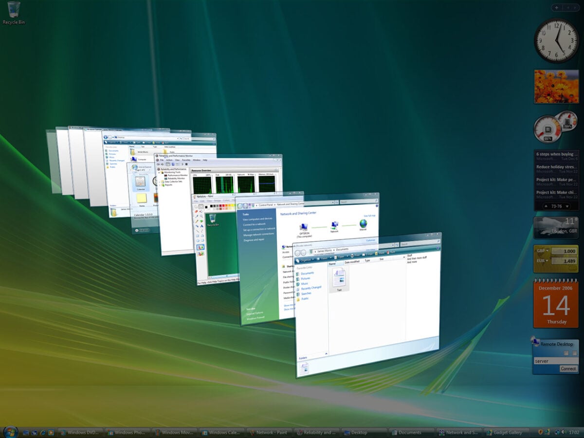
It looked like we were finally living in the future, especially when you pressed Win-Tab and were presented with 3D tiles of your windows. A user interface doesn’t have to be merely functional – just like we enjoy games looking good, it feels rewarding if your OS is using your hardware to look handsome too.
The shadow of Vista
The problem was that Aero was ahead of its time. It required a GPU with DirectX 9 Pixel Shader 2.0 support, and that meant Intel had to race to get a kludge for its underpowered integrated graphics systems to run it. At the start of 2007, GPUs with programmable shaders weren’t always a given. That’s quite different from now, when both AMD and Intel have decent iGPU tech under their belts.
My hard drive was constantly chugging away because Vista was optimising its search system.
It also didn’t help that there were a load of problems with Vista. It was slow. In particular, I remember my hard drive constantly chugging away and holding up performance, because Vista was optimising its search system. Meanwhile, the introduction of User Account Control meant, by default, Windows prompted you for a Yes or No answer for several basic tasks. Apple famously lampooned it in a video at the time. There were a lot of problems with drivers as well.
Microsoft attempted to perform a bit of a reset when it launched Windows 7, which was much quicker, but also left Aero by the wayside. Then Windows 10 and 11 leaned even further into the flat UI aesthetic, and while we were all glad to see the horror of Windows 8’s touch interface consigned to the Recycle Bin, later versions of Windows have played it overly safe in terms of the UI’s appearance – until recently, Windows 11 wouldn’t even let you move the Taskbar.
Even Apple is onboard
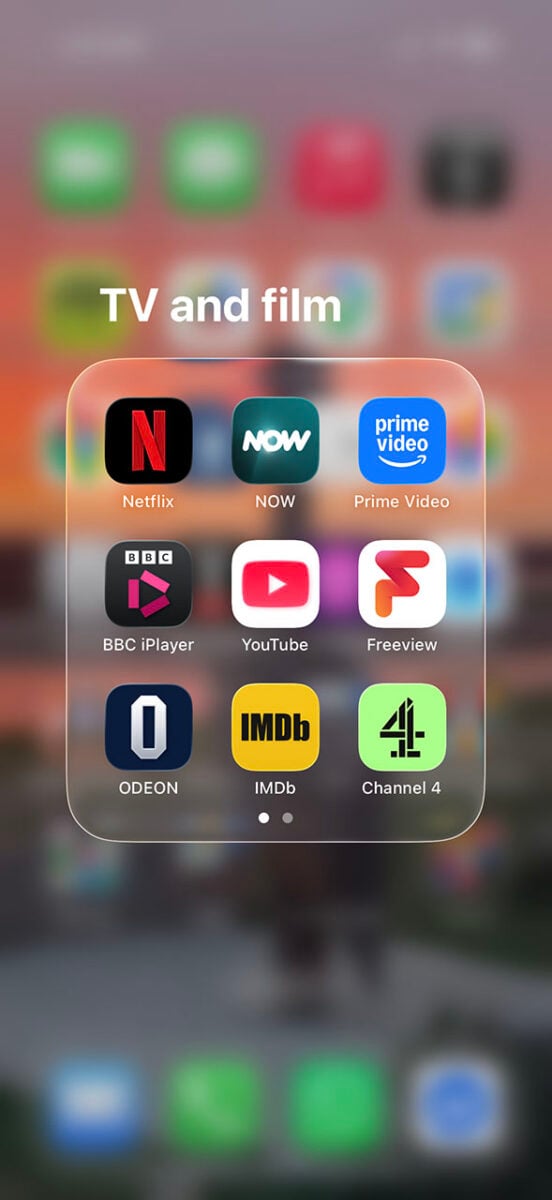
But I sense a change in the air here. Even Apple’s latest versions of iOS and iPadOS now have a glass UI by default. It’s been divisive, with some tech commentators hilariously removing the “gl” from “glass” when discussing it (see what they did there?). As an iPhone and iPad user, though, I love the look of the new OS.
Yes, there are definitely questions around usability – I still struggle to find the search bar in the iPhone IMDB app, as a case in point, as it’s now black and see-through, rather than white. Accessibility is also a factor, given that a glass interface can make text and other UI elements less clear, depending on what’s underneath them. But that can be solved by giving you the option to turn it on or off – let’s not forget that even Vista had a Classic mode that bypassed Aero.

And yes, I’m also aware that there are third-party mods that could give me an Aero effect in Windows 11. That’s not what I want. I’d like Microsoft to officially bring back Aero in Windows 12, fully supported, so software developers can make proper use of it.
Today’s hardware is more than capable of running it, the shadow of Vista has passed, and there’s clearly a hunger for logos and UIs that look good as well as being functional. That doesn’t mean we have to dress Windows like an over-the-top WinAmp skin, but I’d gladly welcome back a classy-looking glass interface. There’s really nothing wrong with asking for a product to look fancy rather than functional, and less isn’t always more.
What do you say, Microsoft? Is there room to add Aero to the list of changes you’re making to Windows right now?